Responsive Design
"Responsive Design" is the strategy of making a site that "responds" to the browser and device that it is being shown on... by looking awesome no matter what.
You can also check out this visual explanation: http://johnpolacek.github.io/scrolldeck.js/decks/responsive/
Background
More devices
Not that long ago building a successful online presence meant just ensuring that your website worked correctly in all the major desktop browsers.
Fast forward to today (2015) and the desktop computer is dying, more than 71% of the US population owns a smartphone.
- 195 million tablet devices were sold in 2013.
- The number of active mobile devices and human beings crossed over somewhere around the 7.19 billion mark.
- New devices like watches and activity trackers are changing the game too
Examples of responsive sites:
Non-responsive sites
You'll be hard-pressed to find a major website that doesn't deal with mobile devices somehow. Reddit isn't specifically responsive, but you do have the option of switching to a mobile-optimized site. If you look at the Reddit site on your phone, try hitting the hamburger menu in the top right corner, and selecting desktop site. How does this change your experience?
The Web has always been responsive
From the beginning, the web has been meant to be shown on a variety of different screens. Text wraps, floats automatically position themselves based on screen size, and we've had percentage sizing in CSS basically forever.
If we go to this simple example, we see that floats reflow, depending on screen width:
See the Pen Float demo by Brian Hague (@bhague1281) on CodePen.
Likewise, the paragraphs remain at 50% of screen width, no matter what this screen width is.
This works to an extent, but we'd really like a few more tools for changing layout based on screen size.
Making Responsive Webpages
The Viewport
When web developers started creating sites for mobile, they had problems with displaying pages that were initially created for desktops. They were too large! The quick fix was to scale pages to fit the screen, but we ended up getting results like this:
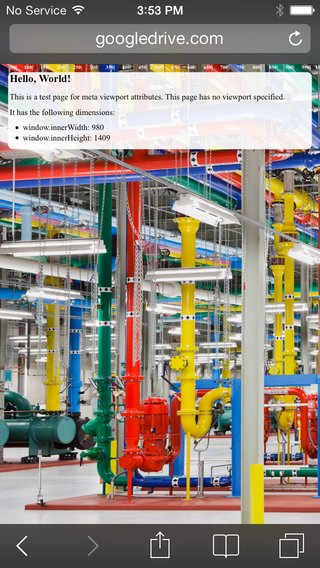
Yikes, that's hard to read on a small device. The solution is that we need to control the width and the zoom level of the page.
When creating sites for mobile (which you should almost always do), we want to control the page width and zoom level of the browser using the viewport tag:
<meta name="viewport" content="width=device-width, initial-scale=1">
Doing so will give us something like this:
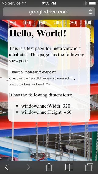
Much better! Pictures courtesy of Google Developers
Media Queries
Media queries are simply a way to conditionally apply styles based on the device the page is being displayed on.
We already know that if we do something like this:
p {
  color: red;
}

p.blue_text {
  color: blue;
}
By default, all p tags will have red text, unless they have the class blue_text, in which case, the text will be blue. We can do a similar thing with media queries.
p {
  color: blue;
}

@media (min-width: 600px) {
  p {
    color: red;
  }
}
Now, all p tags will be red, until the screen size reaches 600px, when they'll turn blue.
A potentially more useful example would be to float all list items left until a certain screen size, then revert the list items to block, causing them to stack.
li {
  display: block;
  color: blue;
}

@media (min-width: 600px) {
  li {
    display: inline-block;
    color: red;
  }
}
Along with min-width, you can also provide max-width to a media query, as well as combine different device orientations and resolutions. For example, here's a media query that will apply to the list elements between 600-1000px.
@media (min-width: 600px) and (max-width: 1000px) {
  li {
    display: inline-block;
    color: black;
  }
}
Most of the time, min-width and max-width will be your bread and butter. You can read more about media queries at MDN's website. See Additional Topics for more links.
Columns Example
See the Pen Media Query Columns Example by General Assembly (@ga-sg) on CodePen.